Image composition, cropping, and copy space
Use focal points, copy space, and intentional crops to choose image compositions that remain clear across desktop and mobile layouts.
A stock image rarely appears alone. It shares space with a headline, a button, a caption, or neighboring content. Choosing a composition means anticipating those relationships, not simply picking the nicest rectangle in the library.
Identify the focal point in an image
Identify where your eye goes first. It might be a bright object, a face, a sharp edge, or the meeting point of two strong lines. That is the visual anchor. If your design places a large headline over the same area, the image and the words compete for attention.
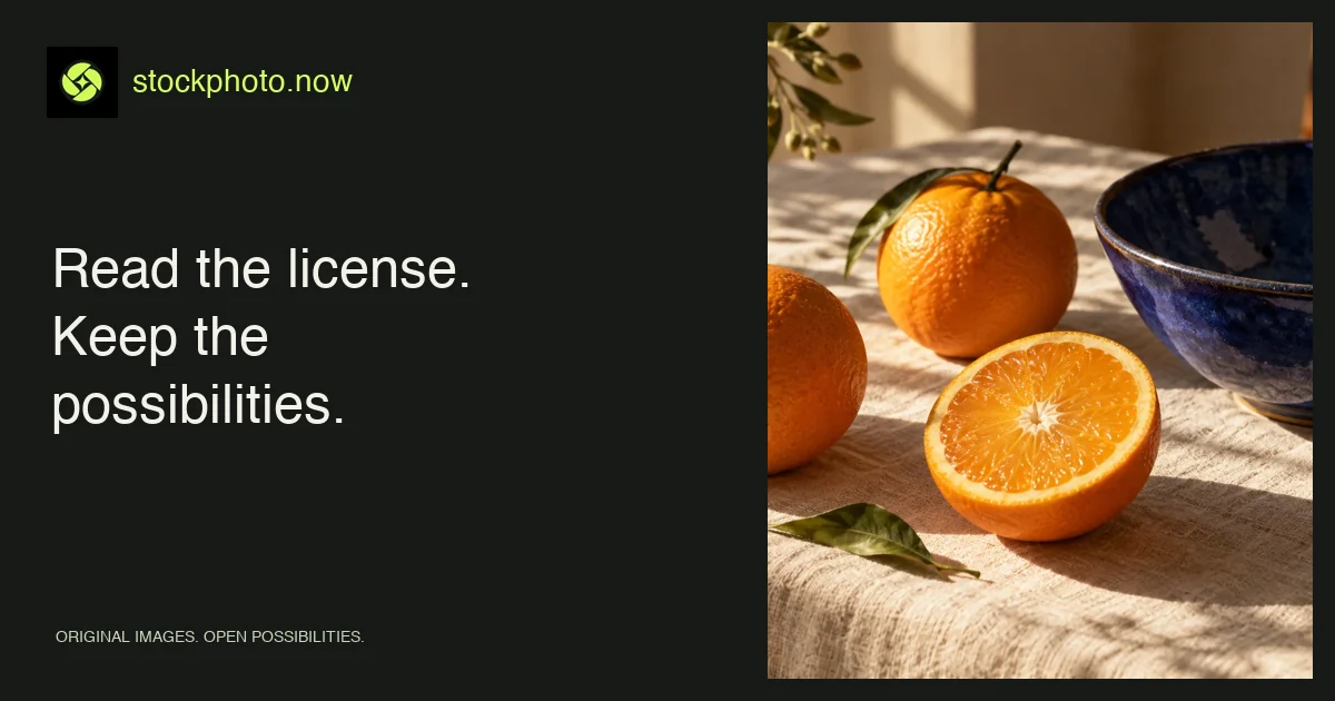
In the desert image, the ridge and its shadow create a natural path through the frame. In the orange still life, the saturated fruit draws attention quickly. Decide whether that movement should lead toward the headline or remain separate from it.
Choose image copy space for readable text
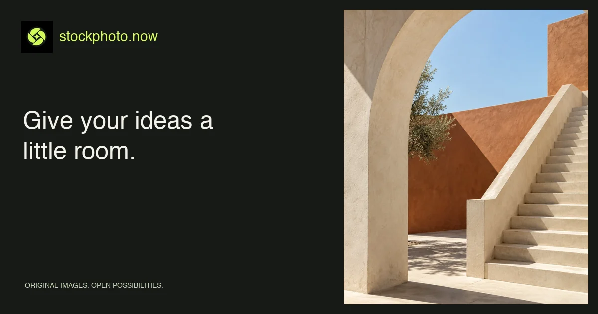
Copy space is an area where text can sit without losing clarity. It does not have to be perfectly blank. A softly shaded wall may work; a field of finely detailed leaves usually creates more visual noise. Look for relatively consistent brightness and restrained texture.
Test your longest realistic headline. A composition that works with “Summer” may fail with “A slower way to spend your summer.” Keep the text as live HTML rather than baking it into the image so it can reflow, remain selectable, and be read by assistive technology.
Plan image crops for mobile screens
Wide banners can lose much of their content when cropped into a portrait-shaped mobile area. Before committing, draw the narrow crop over the source. Does the subject still make sense? Does the location of the focal point leave room for navigation or text?
If one crop cannot serve both layouts, use a separately prepared mobile crop with the same subject, or move the text outside the image. A tall fixed-height banner is not mandatory. Often the clearer mobile treatment is a readable text block followed by the visual.
Use image contrast to support your design
Do not judge readability from a large design canvas alone. Review the component at its actual size with ordinary screen brightness. A gradient behind type can reduce variation, but its strength should be tested against the actual colors. Use W3C’s contrast guidance when evaluating text.
Keep small labels away from high-detail edges. Avoid relying on color alone to distinguish an interactive button from the surrounding image. Clear button shapes and concise labels help the interface remain understandable.
Build a reusable image crop checklist
- One clear subject remains visible.
- Text has a stable, readable background.
- The crop works at the narrowest supported width.
- No edge cuts create accidental ambiguity.
- The image’s resolution supports the display size.
For a full selection process, return to the image brief guide. For the technical handoff, continue with WebP, sizing, and delivery. If the crop cannot protect the subject, compare Smart Resize with the AI image extender.
Apply this guide with image tools and collections
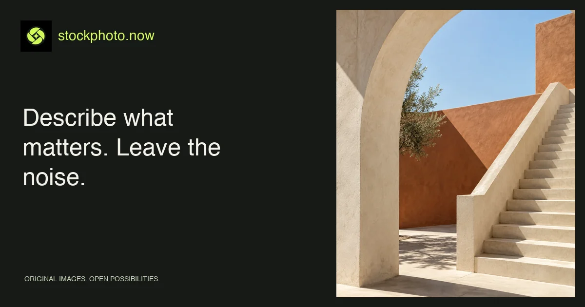
Test a different format with the AI image resizer, or study strong lines and open space in the architecture category.
Find your image