How to choose stock images for any project
Learn how to choose stock images that support your message, fit the available layout, match your visual style, and meet practical usage needs.
The most useful search often begins before you type a keyword. A stock image has a job: introduce a subject, establish a mood, explain a step, or help someone imagine a result. Decide which job matters before you compare attractive pictures.
Match the stock image to your message and mood
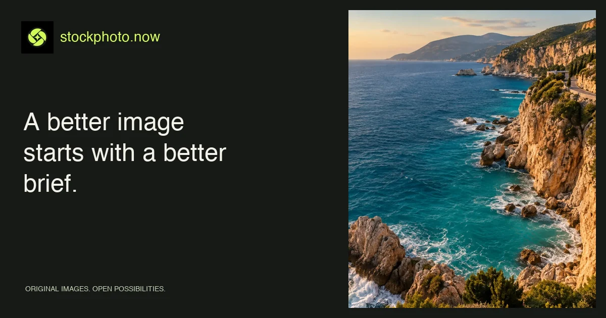
Write one sentence describing what the reader should understand. “This is a calm place to take a break” leads to a different image from “This is an adventurous coastline to explore.” Both might use the sea, but the first benefits from open space and a quiet horizon; the second might need movement, steep terrain, or a strong sense of scale.
Make a short brief with four fields: subject, intended feeling, placement, and exclusions. For a sustainable packaging article, that could be “paper textures; practical and tactile; wide article header; no leaves used as a substitute for evidence.” A picture can establish a tone, but it cannot prove the environmental claim in the copy.
Combine subjects and visual details in image searches
Try a subject plus a visible attribute: “orange still life,” “blue coast,” or “minimal architecture.” Add an orientation only when the layout demands it. If a search becomes too narrow, remove the mood word first. A small curated library may describe an image differently from the vocabulary in your brief.
Use the color filter in image search when you need a consistent palette. A campaign built around cream, cobalt, and orange may feel coherent even when its images depict different subjects. Save a few candidates rather than downloading the first plausible result.
Check the stock image inside your project layout
Test the crop in the intended component. A beautifully centered subject can fail when a mobile banner cuts off its edges. Leave sufficient quiet space behind type, then check the text contrast at the real display size. Do not assume that a dark overlay makes every photograph readable.
- Preview desktop and narrow mobile crops.
- Keep essential subjects away from edges that may disappear.
- Check faces, hands, architecture, and small objects for implausible details.
- Compare the file’s pixel dimensions with the display size.
- Read the license and any image-specific restrictions.
Choose AI images for conceptual stories
Generated imagery can work well for concepts, moodboards, and imagined settings. It is a poor substitute for evidence of a real event, an actual property, a particular product, or a customer experience. Stockphoto.now labels its library images as AI-generated; keep that distinction in your own context when it affects what the audience may believe.
For an article about a real hotel, use verified images of that hotel. For a general creative exercise about quiet interiors, an imagined space can be appropriate if the presentation is clear. See our guide to responsible AI image use.
A five-minute stock image selection workflow
Write the brief, collect three candidates, test each in the smallest layout, check the usage terms, and choose the one that communicates most clearly. Keep a record of the image page and license with the project. For layout decisions, continue with composition and copy space. For file delivery, read the WebP workflow.
Apply this guide with image tools and collections
Put the checklist to work in the stock image categories, or compare what other visitors are exploring in popular images.
Find your image