How to Choose Stock Images for Marketing Posters That Fit Your Brand
Choose stock images that fit your brand, leave room for text, print clearly, and meet licensing requirements for AI and traditional photography.
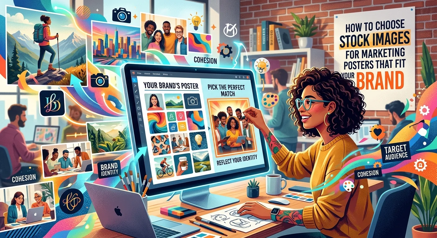
A beautiful image can still make a terrible marketing poster. Your headline disappears into the background. The colors clash with your logo. A crop cuts off the detail that made the photo appealing. Choosing the right stock image starts with how your poster needs to work, rather than how impressive a thumbnail looks.
For a small business, that choice affects both your budget and your message. You need an image that feels familiar to your customers, supports your offer, and holds up in print. A few clear selection criteria can help you narrow the options before you spend money or hours adjusting a design.
Your Image Selection Checklist
- Choose a subject that supports one clear marketing message.
- Leave calm, usable space for your headline and offer.
- Match your brand’s palette, lighting, and personality.
- Check pixel dimensions against the image’s final printed size.
- Verify commercial permissions for both AI-generated and traditional stock.
Start With the Message Your Poster Needs to Deliver
Before searching, write one sentence about the poster’s job. Perhaps you want nearby residents to try your lunch special. Perhaps you need appointments for a new service. Perhaps you are promoting a weekend workshop. That sentence gives you a useful filter for every image you consider.
A bakery promoting breakfast needs a different visual from one advertising wedding cakes. Both could use attractive food photography. But a close view of a pastry beside a coffee cup supports a morning offer more directly than a formal dessert display.
Think about where customers will see the poster, too. A storefront window may give you only a moment to communicate. A poster inside a waiting room can support more detail. Choose a subject people can recognize at the expected viewing distance.
Keep the promise honest. Stock photography should not suggest that your business sells a product, offers a facility, or employs a person it does not. For an offer tied to your actual food, premises, or results, your own photograph may be the better choice. Stock works especially well for supporting moods, seasonal themes, and broader service concepts.
Find Space Where Your Text Can Breathe
Your poster needs somewhere to put its headline, price, contact details, and call to action. Look for negative space, which means an area with little visual activity. A plain wall, soft sky, or gently blurred background can give text a comfortable home.
Empty space alone does not guarantee readability. A pale background may suit dark lettering, while a deep, even background can support light lettering. A patchwork of bright and dark details often creates problems, even when the area contains no main subject.
Test your actual headline over the preview before licensing the image, if the provider permits layout testing. Use roughly the font size and placement you expect in the finished poster. A placeholder word will not reveal whether a longer offer fits.
Check the Crop Before You Commit
A landscape image may lose its useful space when you place it in a portrait poster. Try the intended proportions early. Keep faces, products, and other meaningful details away from edges that could be trimmed.
Pay attention to the subject’s direction. Someone looking toward your headline can help the layout feel connected. A person looking out of the poster may pull attention away from the offer. Treat this as a design cue, then judge the complete layout.
If every text placement requires a heavy overlay or awkward crop, keep searching. A small adjustment can help. Rebuilding the image around your copy often costs more time than choosing a better starting point.
Match Your Brand Through Color and Mood
Brand fit goes beyond finding a photo with your logo’s main color. Lighting, contrast, texture, and setting also shape how an image feels. A softly lit interior suggests something different from a sharply lit industrial workspace.
Choose a few words that describe your business. A neighborhood florist might use warm, relaxed, and personal. A repair service might choose clear, capable, and dependable. Use those words to judge images alongside your existing signs, website, and printed materials.
Look for a dominant color that works with your palette. Then check smaller accents. A bright red object can compete with a green promotional badge, even if most of the photograph is neutral. Your headline and offer should remain easy to spot.
You do not need every image to match perfectly. Consistent warmth, saturation, and contrast can connect different subjects across a campaign. Save a few approved examples as a reference. This makes future choices faster and keeps each poster from feeling as though it belongs to a different business.
Use Editing to Support an Already Suitable Image
Minor color adjustments can bring an image closer to your brand. Test those changes before committing. Strong filters can make skin tones unnatural, distort product colors, or remove detail from shadows.
For product-focused advertising, accuracy deserves extra attention. A dramatic edit that changes the apparent color of clothing or food may create the wrong expectation. Choose a compatible image first, then make restrained adjustments.
Test the Image in a Real Poster Layout
Once you have a small shortlist, move from browsing to a rough design. Creating a custom poster gives you a natural use case for testing these choices before committing to a final layout. Place the headline, offer, logo, and contact details where customers will actually see them.
Use the same copy and layout for each candidate. That makes the comparison fair. You can judge whether one image gives the headline more space, feels closer to your brand, or makes the offer easier to understand.
For example, a yoga studio might compare a crowded class scene with a simpler image containing one person and a calm background. The class scene may communicate community. The simpler option may provide more room for an introductory offer. Your campaign goal should decide which advantage matters most.
View the design at a reduced size to test its overall hierarchy. Then inspect it at the intended physical size where possible. Ask someone unfamiliar with the campaign what they notice first and what action they think they should take. Their answer can reveal a layout problem before printing.
Check Resolution at the Final Printed Size
A sharp screen preview does not prove that an image will print clearly. Check the downloaded file’s pixel dimensions and how large the image will appear on paper. The relevant measure is pixels per inch, or PPI, at that placed size.
For printed material viewed closely, 300 PPI is a common production target. Larger posters viewed from farther away may work at a lower resolution. Ask your printer what they recommend for your poster size, paper, and viewing distance before purchasing the file.
The calculation is straightforward. Multiply the image’s width in inches by the target PPI, then do the same for its height. An image filling an 18 by 24 inch poster at 300 PPI needs 5,400 by 7,200 pixels, before allowing for bleed or cropping.
If the photograph occupies only part of the poster, calculate its requirements using that smaller area. A six-inch-wide photo needs fewer pixels than a full-width background. Cropping also reduces the pixels available, which makes the original download size only part of the assessment.
Inspect Detail Before Sending the File to Print
Open the image at full size and examine faces, edges, textures, and fine details. Look for compression artifacts, excessive sharpening, or soft areas that could become distracting when enlarged. With AI-generated stock, also check hands, lettering, reflections, and repeated objects.
Upscaling may help some images, but it cannot guarantee accurate missing detail. Inspect the enlarged result before using it. Changing a resolution label to 300 PPI without adding pixels does not create a sharper image.
Request the printer’s bleed, color profile, and export specifications. Bleed extends artwork beyond the trim edge, while a safe margin keeps text inside it. A physical proof is especially useful when brand colors or subtle shadow details affect the design.
Read the License Before Using Traditional Stock
Treat the license as part of image selection. Check whether it permits commercial advertising, printed posters, your planned quantity, and the edits you intend to make. A paid download does not automatically cover every use.
Images labeled for editorial use typically come with restrictions that make them unsuitable for ordinary promotional posters. Read the asset’s specific terms. Also check whether attribution is required and whether your designer or print supplier may access the file to complete the job.
Recognizable people and certain properties can raise separate permission questions. Look for release information and any restrictions attached to the asset. A model release does not necessarily permit sensitive uses or copy that suggests the person endorses your business.
Distinguish a poster advertising your business from a poster sold as a product. Merchandise and resale uses may require different permissions. Print quantity limits can also vary by provider and license type.
Keep the receipt, asset identifier, license version, and relevant release information with your project files. This gives you a clear record when you reorder prints or adapt the campaign later.
Apply Extra Checks to AI-Generated Stock
AI-generated stock needs the same commercial-use review, plus a closer look at the provider’s AI terms. Check whether the license covers printed advertising and whether any promised legal protection includes the particular asset and use.
Do not assume that an AI label removes rights concerns. Inspect the image for recognizable logos, characters, celebrity likenesses, or other details that could create problems. Avoid visuals that imply a real person supports your offer without permission.
Separate permission to use the file from ownership or exclusivity. A commercial license may allow a poster campaign without giving you exclusive rights to the image. Check those terms before treating stock artwork as a permanent brand identifier.
Accuracy matters here, too. An AI-generated restaurant interior should not pass as a photograph of your premises. A fictional person should not appear beside a testimonial in a way that suggests they are the customer quoted. Choose visuals that support the message without inventing evidence for it.
If the terms are unclear, ask the provider about your specific use before paying. Describe the poster, distribution, print quantity, and whether it will be sold. A concrete question is easier to answer than a broad request about commercial rights.
Choose the Image That Earns Its Place on Your Wall
The strongest choice supports your message, gives your words room, feels consistent with your business, and meets the requirements for print and licensing. A beautiful image that fails one of those checks can become an expensive compromise.
Build a small shortlist and compare each option in the same layout. Confirm the file size and permissions before making the final purchase. Then review a proof with fresh eyes, paying particular attention to the headline, offer, and contact details.
Your customers should understand what you offer without working to read the poster. Choose an image that helps them reach that understanding, and your design has a much stronger foundation.
Apply this guide with image tools and collections
Browse the stock image categories or use the AI image tools to put this guidance into practice.
Find your image