How to Combine Stock Photos and PNG Graphics for Marketing Designs
Combine stock photos and PNG graphics into clear website banners, slides, and social posts with practical tips for layout, color, and readable text.
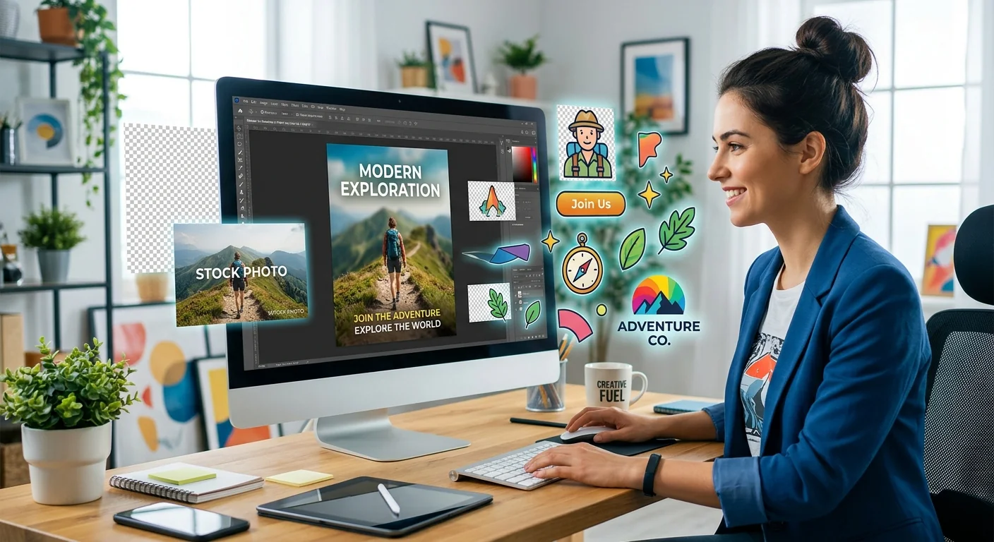
Your headline is ready. Your photo looks great. Then you add a graphic, and suddenly the design feels crowded. This happens because each piece can look good alone without working as part of a layout. A stock photo provides the setting. A PNG graphic adds a focused detail. Text explains the offer. Give each element a clear job, and you can build a polished website banner, presentation slide, or social post without spending hours nudging things around.
Three Moves for a Clearer Layout
- Choose a photo with open space for your message.
- Match your PNG graphics to the photo’s color and visual style.
- Check text readability at the size your audience will see.
Give Your Photo, Graphic, and Text Different Jobs
Start with the message you want someone to understand. A sale announcement needs a clear offer. A webinar banner needs a topic and date. A presentation slide needs one main idea. Write that message before searching for images. It becomes your filter for choosing assets.
Think of the photo as context. It might show a workspace, a landscape, or a person using a product. Your PNG should add something useful, perhaps a product cutout, a small symbol, or a decorative shape that directs attention. The headline should remain easy to find.
Choose one main visual subject. If the photo already features a large face or a prominent product, keep the added graphic modest. If the PNG product is the hero, choose a quieter background. Two large subjects competing for attention usually make the message harder to follow.
Choose a Background That Leaves Room to Work
A useful marketing background has space where text can sit comfortably. Look for a plain wall, open sky, blurred area, or uncluttered tabletop. That empty area gives your headline breathing room. It also reduces the need for heavy editing.
Judge photos inside the shape of your intended design. A wide landscape may fit a website banner but lose its useful details in a square post. Crop a candidate image before committing to it. Check whether the subject, text area, and added graphic can all fit.
- Look for quiet areas: Place text away from faces, patterned clothing, branches, and other detailed surfaces.
- Check the direction of attention: A person looking toward your headline can help connect the photo and message.
- Leave cropping room: Keep useful details away from edges that may disappear in another format.
- Inspect image quality: Choose enough pixel detail for the final crop without stretching the photo heavily.
For AI-generated stock photos, examine hands, objects, signs, and background details before adding graphics. A strange reflection or distorted object becomes more noticeable when placed near a crisp cutout. Select an image that already works, then build your layout around it.
Build a Clear Path Through the Composition
Place your headline first. Position the main subject next, then add the PNG. This order helps you protect the message instead of squeezing it into whatever space remains.
A dependable starting layout puts text on one side and the main visual on the other. You can also place a product cutout near the lower corner, with the headline above it. Keep related elements close. A price, product name, and product graphic should feel connected.
Use alignment to make the composition feel intentional. Line up the headline, supporting copy, and action with the same left edge. Keep a consistent margin around the canvas. Most editors offer guides that make this easier.
Overlap can help a cutout feel connected to its setting, but use it carefully. A product may sit partly over a tabletop or a decorative shape. Avoid covering someone’s face or obscuring the offer. If an overlap creates confusion, separate the elements and give them more space.
How the Layout Changes Across Marketing Formats
| Format | Photo Choice | PNG Placement | Text Priority |
|---|---|---|---|
| Website banner | Wide scene with space for changing crops | Beside the message, clear of the action button | Brief headline and a clear next step |
| Presentation slide | Simple scene that supports one idea | Near the point it helps explain | Large heading with minimal supporting copy |
| Social post | Strong subject that survives a compact crop | Large enough to recognize on a phone | One message readable at feed size |
Select PNG Graphics That Suit the Scene
A PNG file can support transparency, which lets a graphic sit over a photo without a rectangular background. The file extension alone does not guarantee transparency. Some downloads contain a solid background or even a checkerboard pattern baked into the image.
Browse picture PNG options when you need graphics to layer into a layout. Before downloading, check transparency, resolution, and usage rights. Make sure the asset’s terms cover your intended marketing use, including any attribution requirements. Keep a record of the source and license terms for the files you choose.
Once imported, place the graphic over both a light area and a dark area. This makes rough edges, pale outlines, and leftover background pixels easier to spot. Inspect fine details at normal viewing size as well as close up.
Check the dimensions of the visible graphic, too. A large PNG canvas may contain a small object surrounded by transparent space. Enlarging that object can still produce soft edges. Choose a file with enough detail for its actual placement in the exported design.
Match Color, Lighting, and Graphic Style
Your assets do not need identical colors, but they should feel related. Pick one or two accent colors from your brand or the photo. Repeat those colors in a shape, headline, or small graphic. A limited palette helps separate files feel like one design.
Pay attention to lighting when adding realistic cutouts. A product lit from the left may look awkward in a scene with strong light coming from the right. Warm indoor lighting can also clash with a cool, blue-tinted cutout. Small adjustments to warmth, brightness, and saturation may bring them closer.
If the object is meant to appear inside the photographed scene, check perspective and scale. A mug resting on a desk needs a believable angle and size. Add a subtle contact shadow beneath it if needed. Keep the shadow consistent with the photo’s existing shadows.
A flat illustration can work over photography without pretending to be a physical object. Treat it as a graphic accent. Repeat its style elsewhere, perhaps through a matching shape or icon. Avoid mixing several illustration styles, outline widths, and shadow effects in the same layout.
Protect Readable Text From Busy Backgrounds
Text needs a stable surface. A headline can vanish where a photo changes from dark foliage to bright sky. Move it to a quieter area, add a solid panel, or place a dark overlay behind it. Check every line, since one readable word does not guarantee the whole headline works.
For web content, text contrast guidance specifies a minimum ratio of 4.5:1 for ordinary text and 3:1 for qualifying large text, with exceptions. Use a contrast checker to test your chosen text and background colors. On a photo, check the least favorable areas behind the letters.
Choose a font with clear letter shapes. Thin lettering can become difficult to read after resizing or compression. Keep the headline brief enough that it does not need to shrink. Supporting copy should add useful information instead of repeating the heading.
For website banners, keep the headline and button as live webpage elements where possible. That gives your site more flexibility when screens change size. In slides, keep text editable in the presentation file. Social graphics often contain embedded text, which makes checking the exported image especially useful.
Assemble the Design in a Repeatable Order
A simple sequence prevents repeated adjustments. Any editor with layers, cropping, and text controls can support this workflow. Start with the intended format and finish by checking the exported result.
- Set the canvas: Use the dimensions required by the website, slide deck, or social placement.
- Add and crop the photo: Preserve the main subject while leaving room for the message.
- Place the headline: Establish its size, alignment, and reading area before adding decoration.
- Insert the PNG: Resize it proportionally and give it a clear relationship to the photo or message.
- Adjust the visual match: Refine color, brightness, and any necessary shadow.
- Review the export: Check the finished file at its intended viewing size.
For a workshop campaign, you might choose a desk photo with open space on the left. Place the workshop title there. Add a small notebook cutout near the lower right, then repeat its accent color in the date label. The layout has a setting, a relevant graphic, and a clear message. It does not need extra decoration to feel complete.
Adapt Each Version Before Publishing
Reuse your assets across formats, but adjust their placement. A wide banner rarely becomes a strong portrait post through resizing alone. Move the subject, shorten the headline if necessary, and give the PNG enough room to remain recognizable.
Preview a website banner at narrow and wide widths. Check slides in presentation mode from a comfortable distance. View social posts on a phone. These checks reveal problems that can stay hidden while you work on a large editing canvas.
- Check the reading order: The headline and main visual should be easy to identify immediately.
- Check the edges: Keep text, logos, and useful details clear of cropping and interface overlays.
- Check the export: Look for blurry lettering, rough cutout edges, and unexpected backgrounds.
- Check the file size: Compress web images and inspect the result for visible quality loss.
You can keep a transparent PNG in your editable project without exporting the entire finished design as PNG. A flattened photographic banner may work better as JPEG or WebP, depending on your publishing setup. Keep the layered source file so later edits remain straightforward.
Make the Layers Feel Like One Message
The strongest photo and PNG combinations are easy to understand at a glance. The background provides context. The graphic supports the idea. The text gives the viewer a reason to act.
Before finishing, remove any element that has no clear purpose. Then check the spacing and readability again. Save the working layout as a reusable template, with room to swap the photo, graphic, and headline. Your next campaign can start from a dependable composition instead of an empty canvas.
Apply this guide with image tools and collections
Browse the stock image categories or use the AI image tools to put this guidance into practice.
Find your image